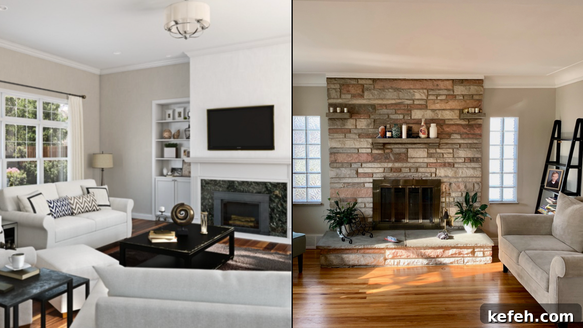
Choosing the right paint color for your home can be challenging, especially when two popular neutrals look similar. If you’re deciding between Revere Pewter and Agreeable Gray, this guide outlines their differences and helps you pick the best shade based on lighting, finishes, and room function.
Below you’ll find color profiles, lighting behavior, ideal rooms, complementary pairings, and practical advice for long-term performance to help you make an informed choice.
Understanding Revere Pewter and Agreeable Gray
At first glance these two greige colors appear close, but they respond differently to light and surrounding materials. Knowing their undertones and reflectance helps prevent surprises once paint is applied to walls.
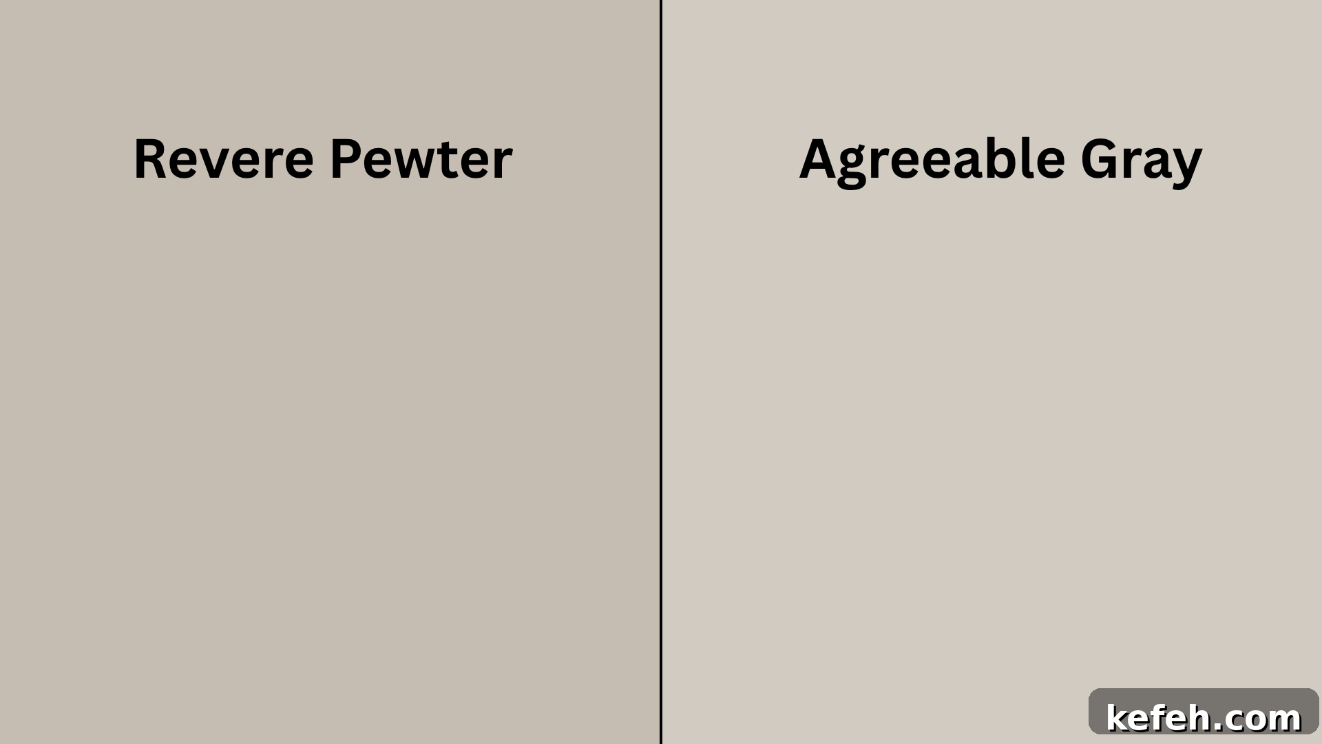
Revere Pewter (HC-172) by Benjamin Moore
Revere Pewter is a warm beige-gray with subtle green-beige undertones. It has a grounded, classic feel that works well with wood, stone, and earthy textures, making it a favorite in traditional and transitional homes.
Basic Color Profile
- HEX code: #CBC6B8
- LRV (Light Reflectance Value): 55.98
- Color Family: Warm beige with green-beige undertones
This shade can shift noticeably in cool or low light, sometimes pulling slightly green, so always test samples in your own rooms before committing.
Agreeable Gray (SW 7029) by Sherwin-Williams
Agreeable Gray is a light, balanced taupe-gray that reads warm and soft in most lighting conditions. It’s a versatile choice across styles and often used when a consistent neutral is desired throughout a home.
Basic Color Profile
- HEX code: #D1CBC1
- LRV (Light Reflectance Value): 60
- Color Family: Warm taupe-gray with subtle beige undertones
Agreeable Gray typically remains steady in both natural and artificial light, which makes it a strong option for full-home applications.
Revere Pewter vs. Agreeable Gray: Side-by-Side Look
| Feature | Revere Pewter (Benjamin Moore) | Agreeable Gray (Sherwin-Williams) |
| Color Family | Warm beige with an earthy base | Light taupe-gray with soft warmth |
| Undertones | Subtle green and beige | Taupe with slight warmth; no green |
| LRV | 55.98 (moderate depth) | 60 (slightly lighter) |
| Finish Effect | Feels solid and cozy | Creates a clean, soft backdrop |
| Common Uses | Entryways, dining rooms, exteriors | Living rooms, kitchens, whole-home schemes |
| Lighting Impact | May read darker or greener in cool, low light | Holds tone well across lighting setups |
Small differences in undertones and light reflectance can dramatically change how these colors appear on your walls. Testing is essential.
How Lighting Affects Them
Lighting alters tone and mood. Below is a practical summary of how each color behaves in common lighting scenarios.
| Lighting Condition | Revere Pewter | Agreeable Gray |
|---|---|---|
| Daylight | Warm and grounded with a faint green cast in some exposures | Bright, balanced, and soft |
| Warm Light (Evening) | Deeper and cozier; emphasizes warmth | Gentle and slightly warmer than daytime |
| Low Light / Shade | Can feel muted and heavier | Reflects light and supports an open, airy feel |
Agreeable Gray typically provides more consistent results across different exposures, while Revere Pewter is more sensitive to lighting and nearby colors.
Rooms Where Each Color Works Best
Both colors have ideal applications depending on the mood you want to create and how much natural light the room receives.
Living Spaces (Living Room, Family Room)
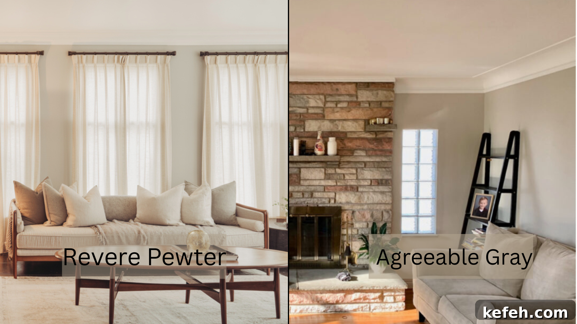
Use Revere Pewter in formal living rooms or dens for a warm, settled atmosphere. Agreeable Gray is better for open or smaller living areas where you want a bright, neutral backdrop that complements furniture without competing with it.
Kitchen & Dining Areas
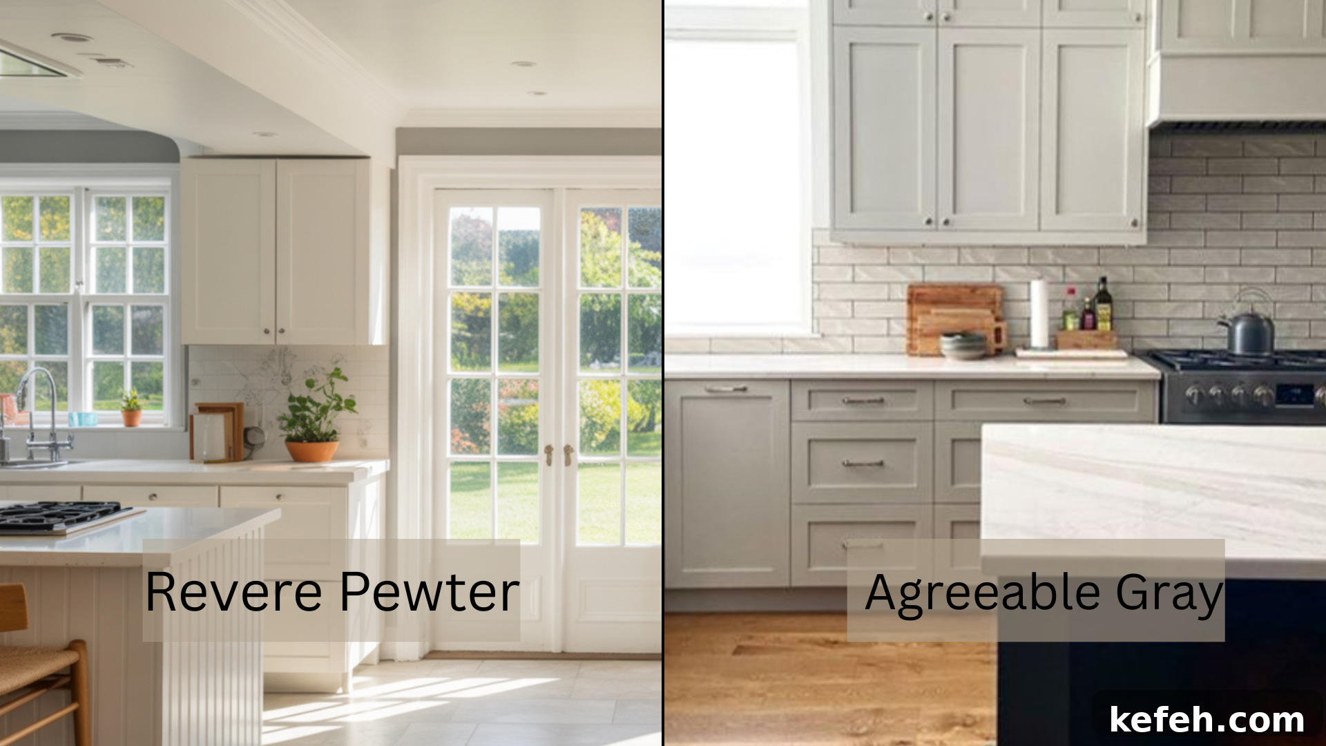
Agreeable Gray is a favorite in kitchens, especially paired with white cabinets and light countertops. Revere Pewter suits dining rooms where a cozier, more intimate tone enhances wood tables and warm lighting. If areas are connected, using one color in the kitchen and the other in the dining room creates complementary interest.
Bedrooms & Bathrooms
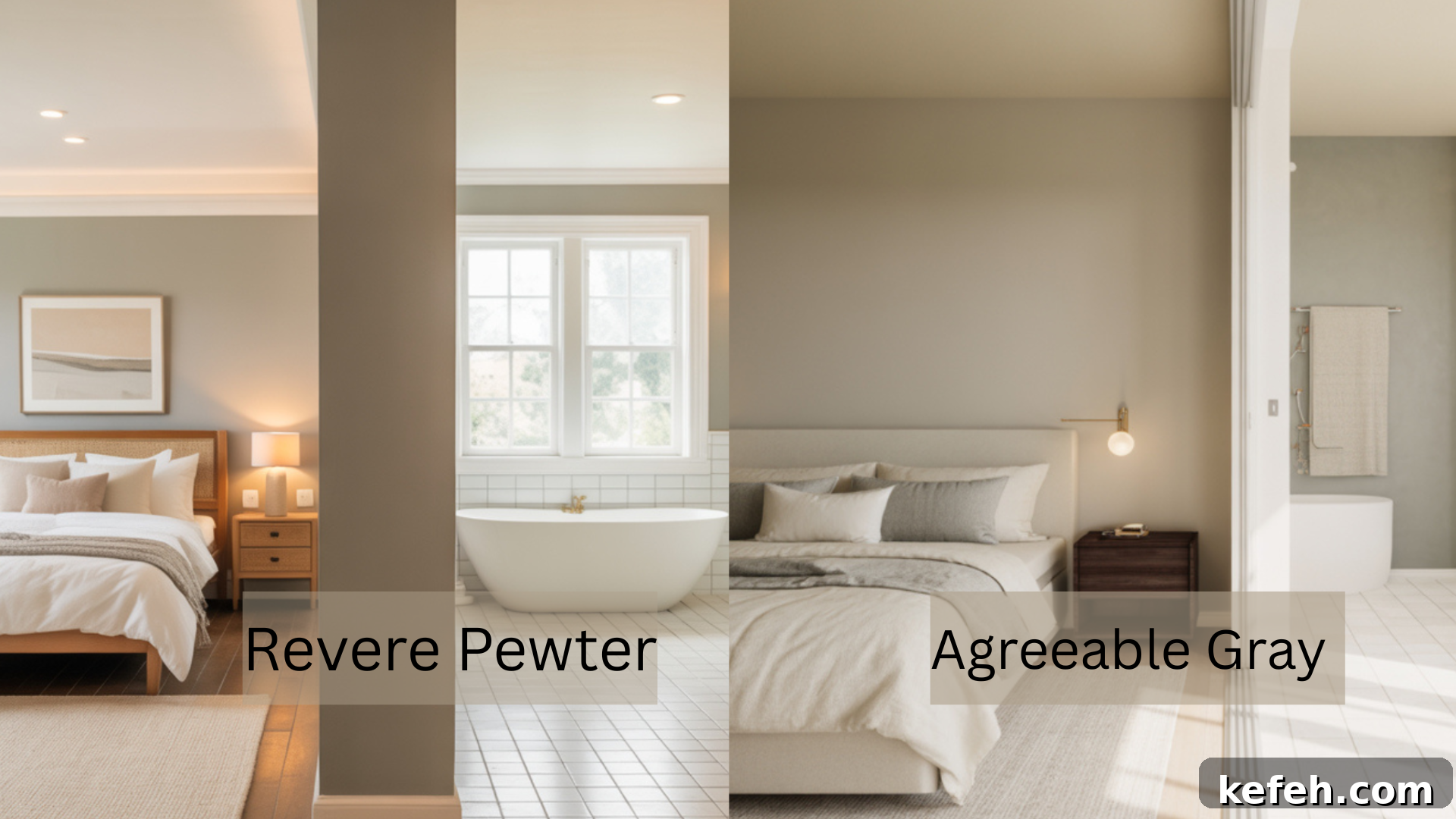
Agreeable Gray supports calm, restful bedrooms and bathrooms with its stable tone under artificial light. Revere Pewter can make bedrooms feel cozy and warm, particularly when paired with wood accents or warm textiles; in bathrooms, choose it only if the space is larger or well lit.
Exteriors & Outdoor Applications
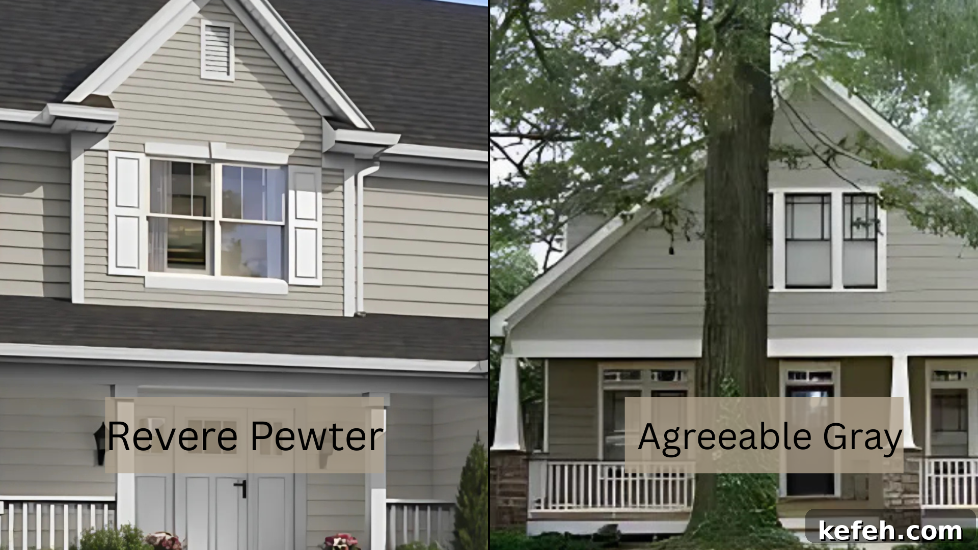
Revere Pewter works well on siding, trim, and doors, especially alongside stone or brick. Agreeable Gray can appear lighter in direct sun but fits nicely on shaded porches, trim, or covered areas. Always test a large swatch outdoors at different times of day.
Matching Each Color to Your Home Style
Choosing between these shades also depends on architectural details, finishes, and the overall style you want to emphasize.
Traditional & Classic Homes
Revere Pewter supports traditional interiors with crown molding and warm wood tones, offering depth without looking heavy. Agreeable Gray will work too but may require stronger contrast or richer accents to avoid feeling too soft.
Transitional & Modern Farmhouse
Agreeable Gray is a natural fit for transitional and modern farmhouse styles, pairing easily with black fixtures, white trim, and wood elements. Revere Pewter can be used as an accent or on cabinetry to add warmth and contrast.
Coastal & Light-Filled Spaces
For coastal or very bright rooms, Agreeable Gray is usually the safer choice because it reads airy and holds up well in sunlit environments. Revere Pewter can feel heavy in bright spaces but makes a nice contrast on doors or shaded walls.
Similar Colors and Close Matches
Below are close alternatives and similar neutrals from various brands to consider when matching trim, accents, or comparing options.
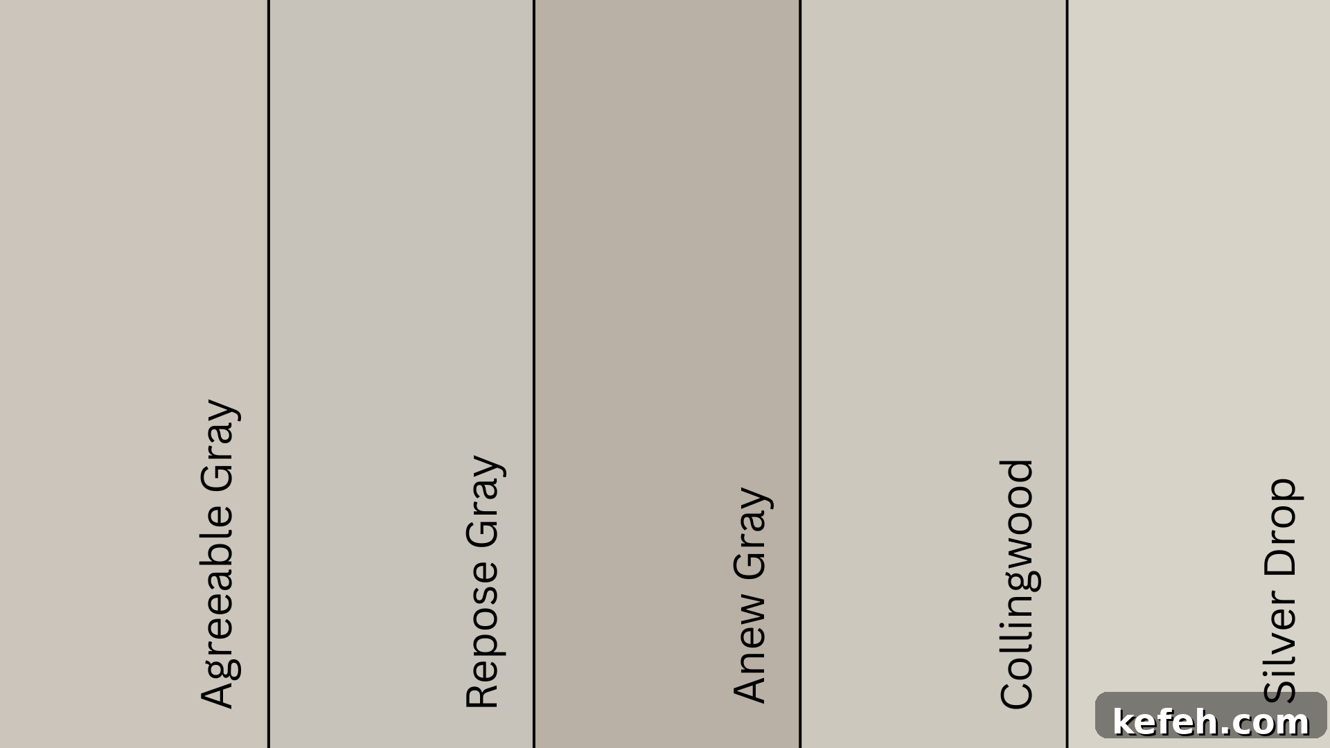
Agreeable Gray (SW 7029): Closest Matches
| Color Name | Brand | Hex Code | LRV | Notes |
|---|---|---|---|---|
| Agreeable Gray (SW 7029) | Sherwin-Williams | #D1CBC1 | 60 | Soft taupe-gray; consistent across lighting |
| Repose Gray (SW 7015) | Sherwin-Williams | #CCC8C1 | 58–59 | Cooler and more neutral |
| Anew Gray (SW 7030) | Sherwin-Williams | #BFB6AA | 47 | Deeper, warmer gray with brown undertones |
| Collingwood (OC-28) | Benjamin Moore | #D3CEC4 | 61.52 | Close match; slightly lighter and soft |
| Silver Drop (7902-C) | Behr | #D8D6CE | ~69 | Light and clean; slightly cooler |
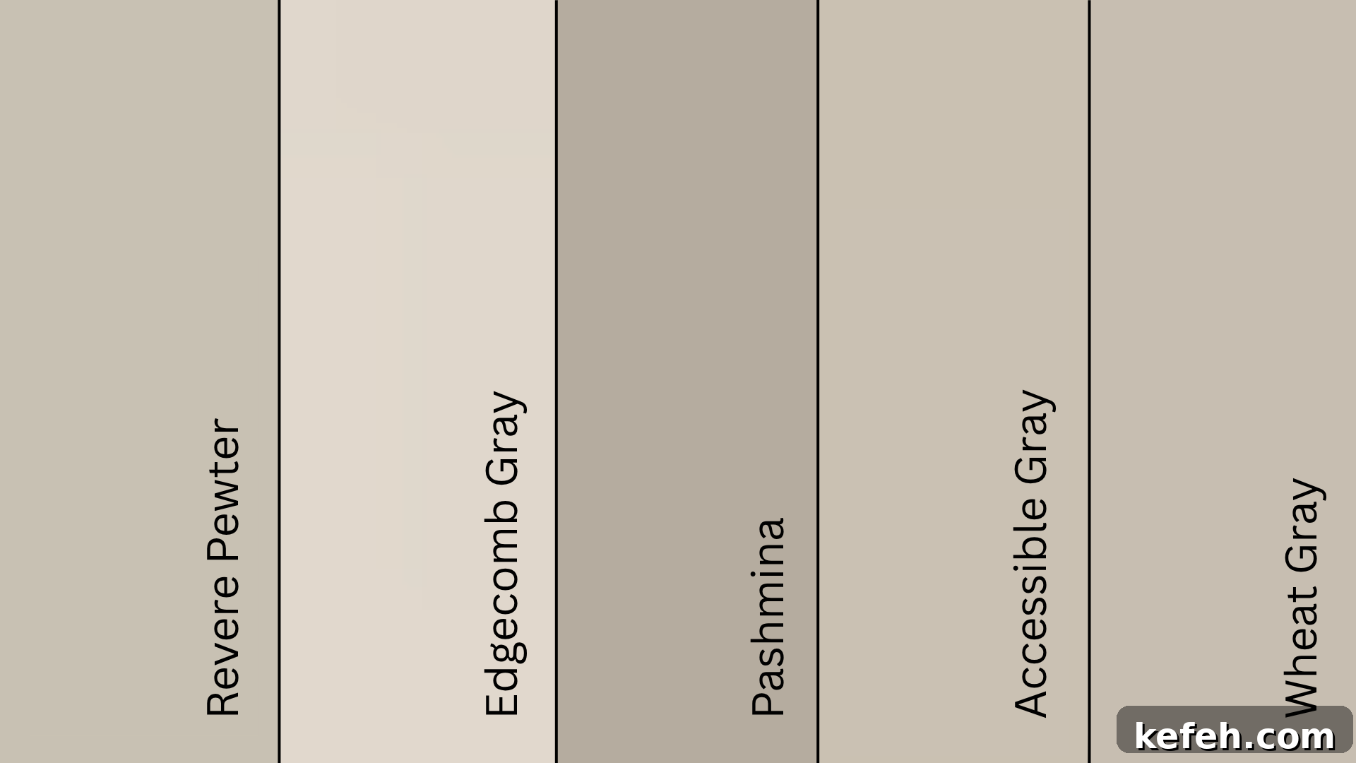
Revere Pewter (HC-172): Closest Matches
| Color Name (Code) | Brand | Hex Code | LRV | Notes |
|---|---|---|---|---|
| Revere Pewter (HC-172) | Benjamin Moore | #CBC6B8 | 55.51 | Warm beige with green undertones; versatile classic |
| Edgecomb Gray (HC-173) | Benjamin Moore | #DAD1C4 | 63.88 | Lighter and less earthy |
| Pashmina (AF-100) | Benjamin Moore | #BBB2A1 | 44.2 | Richer and deeper with a soft brown base |
| Accessible Beige (SW 7036) | Sherwin-Williams | #D1C7B8 | 58 | Warmer beige-gray often cited as a comparable tone |
| Wheat Bread (720C-3) | Behr | #CDC4B7 | ~56 | Similar depth and warmth; slightly softer |
Best Pairings and Trim Suggestions
Choosing the right whites, accents, and wood tones ensures the base color looks intentional and balanced.
Whites for Trim and Ceilings
- Alabaster-like whites add softness without yellowing and suit cozy interiors.
- Pure white options provide a crisp, clean contrast without appearing harsh.
- Softer off-whites sit between and are ideal if you want a muted, understated trim.
Always place swatches side-by-side to determine which white complements your main color and lighting.
Accent Colors to Try
Warm tones such as terracotta, bronze, dusty rose, or olive green highlight Revere Pewter’s earthy side. For Agreeable Gray, navy, charcoal, and slate blue create contrast, while muted pastels or light metals soften the space.
Wood Finishes That Bring Balance
Lighter woods like white oak or birch maintain brightness. Darker woods—walnut or chestnut—add warmth and depth, pairing especially well with Revere Pewter. Try a wood sample next to your swatch before finalizing selections.
Long-Term Wear and Color Longevity
How Each Color Looks Over Time
Revere Pewter performs well in low-light areas and can appear warmer or slightly green in bright light. Agreeable Gray tends to maintain its original tone across various lighting and years, making it a reliable choice for long-term consistency.
Resistance to Fading and Yellowing
Both colors hold up well with proper paint quality and care. Agreeable Gray is generally more forgiving against fading and yellowing in sunny or frequently cleaned areas; Revere Pewter can show subtle shifts depending on exposure and finish.
Summary
Revere Pewter and Agreeable Gray are both excellent neutrals with different strengths. Revere Pewter brings warmth and a grounded, classic feel that pairs well with traditional elements and darker woods. Agreeable Gray offers a stable, light taupe-gray that works across styles and lighting, making it a safe, consistent choice for whole-home palettes.
Test large samples in your rooms at different times of day and next to your intended trim and finishes. That will reveal which color aligns best with your lighting, style, and long-term expectations.